Studio
Studio
Studio
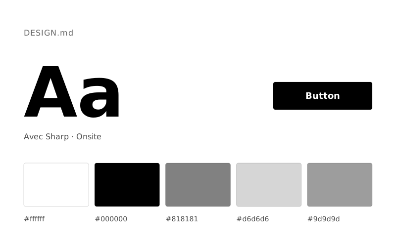
Motto tasarım sistemi açık temalı bir arayüz dili kullanıyor. Ana marka rengi Charcoal Surface (#1b1b1c); metinler Pitch Black (#000000), arka plan Canvas White (#ffffff). Tipografide sans ve disp kullanılıyor. Bu DESIGN.md dosyası 12 renk token'ı ve 8 kademeli bir yazı ölçeği içeriyor; Claude, Cursor veya v0 gibi yapay zekâ araçlarına verildiğinde Motto tarzında tutarlı arayüzler üretmelerine yardımcı olur.
Bağımsız Stil İncelemesi
Architectural Blueprint on White Canvas. Black lines and precise typography articulate structure and ideas against an expansive, bright background.
The Motto® design system evokes an atmosphere of rigorous clarity and understated authority. Its visual language relies on stark contrasts between crisp black text and an expansive canvas of near-white, creating a sophisticated and professional impression. The dominance of bold, custom san-serif typography, particularly the expansive display font, dictates the site's strong visual rhythm. A distinct lack of ornamentation, shadows, or vibrant color accents streamlines the user experience to focus purely on content and impactful messaging.
| Renk | HEX | CSS token | Kullanım (İngilizce) |
|---|---|---|---|
| Pitch Black | #000000 | --color-pitch-black | Primary text, essential icons, borders, interactive states for text links, navigation items, and button outlines. It grounds the design in high contrast and definitive presence. |
| Canvas White | #ffffff | --color-canvas-white | Page backgrounds, card surfaces, ghost button text, and filled button text for contrast. Defines the vast, airy negative space. |
| Charcoal Surface | #1b1b1c | --color-charcoal-surface | Solid button fills for primary calls to action. Provides a rich, deep counterpoint to Canvas White without introducing color. |
| Cloud Gray | #f2f2f2 | --color-cloud-gray | Subtle background for hero sections or alternating content blocks, offering a slight visual break from pure Canvas White without significant tonal shift. |
| Stone Accent | #d8d8d8 | --color-stone-accent | Divider lines, subtle borders, and background accents, providing minimal separation. |
| Ash Text | #4d5153 | --color-ash-text | Secondary body text and subtle link colors, used for less prominent information or tertiary content. |
| Silver Text | #848484 | --color-silver-text | Lighter body text for lists or less emphasized links, contributing to the grayscale palette. |
| Input Border | #c8cacd | --color-input-border | Border color for input fields, indicating interactive areas with a fine, light line. |
| Faint Gray | #717476 | --color-faint-gray | Tertiary body text, used for footnotes or less critical content where readability is still important but emphasis is lower. |
| Vivid Purple | #9c98ef | --color-vivid-purple | Rare, decorative background graphic elements; not part of the primary UI palette. |
| Electric Violet | #6980ff | --color-electric-violet | Rare, decorative background graphic elements; not part of the primary UI palette. |
| Grass Green | #beee98 | --color-grass-green | Rare, decorative background graphic elements; not part of the primary UI palette. |
| Font | Ağırlıklar | Yedek font |
|---|---|---|
| sans | 500 | Inter, Arial, Helvetica, sans-serif |
| disp | 500 | Oswald, Impact, sans-serif |
| Rol | Boyut | Satır yüksekliği | Token |
|---|---|---|---|
| caption | 14px | 1.4 | --text-caption |
| body | 17px | 1.38 | --text-body |
| subheading | 25px | 1.14 | --text-subheading |
| heading-sm | 34px | 1.14 | --text-heading-sm |
| heading | 48px | 1.14 | --text-heading |
| heading-lg | 61px | 1.1 | --text-heading-lg |
| display-sm | 99px | 1 | --text-display-sm |
| display | 154px | 1 | --text-display |