What is a design token?
A design token is the named value of a design decision. #B8422E is a color; color.action.primary is a token that carries the decision “the color of primary actions”. When code, design files and DESIGN.md all use the same name, the decision is managed in one place: change the color and every button, link and icon that uses it changes with it.
Tokens matter for AI tools too. When a tool uses the --color-action-primary variable instead of “an orange button”, the code it produces automatically fits the rest of the brand.
Token types: primitive, semantic, component
Mature design systems organize tokens in three layers:
| Layer | What it describes | Example |
|---|---|---|
| Primitive | The raw value palette | orange-600: #B8422E |
| Semantic | The role of the value | color-action-primary: {orange-600} |
| Component | Its use in a specific component | button-primary-bg: {color-action-primary} |
Thanks to this layering, changing the brand color only means updating the primitive or semantic token; components follow automatically because they are linked by reference. References such as {colors.tertiary} in the DESIGN.md specification work exactly this way.
Which decisions should be tokens?
- Colors: brand, text, background, border and status (success, warning, error) colors
- Typography: font families, size scale, weights, line height, letter spacing
- Spacing: a scale in multiples of 4 or 8 (
4, 8, 12, 16, 24, 32…) - Corner radii: small, medium, large and “fully rounded” (
9999px) - Shadows and layers: elevation levels
- Motion: durations and easing curves (optional)
One token, four formats
MakeMyMD generates a design system from the same decisions in four formats. All of the examples below express the same decisions: the primary and action colors, the body typeface and the medium corner radius.
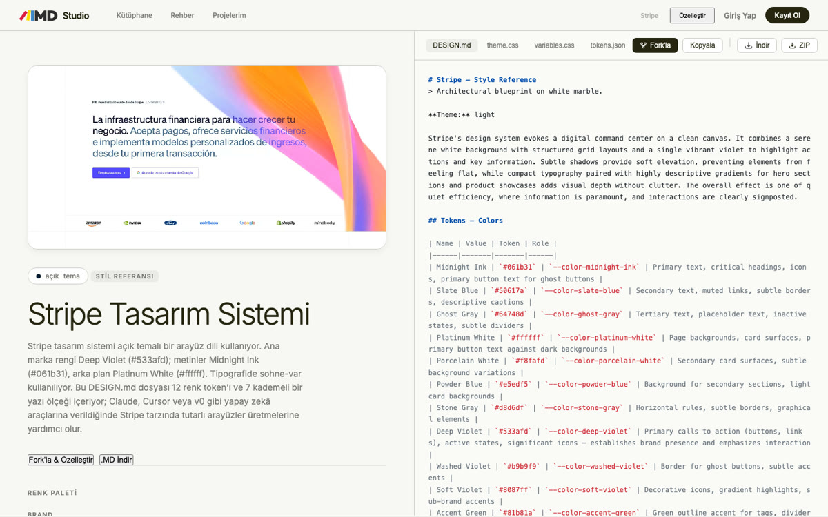
DESIGN.md (YAML front matter)
colors:
  primary: "#1A1C1E"
  tertiary: "#B8422E"
typography:
  body-md:
    fontFamily: Public Sans
    fontSize: 1rem
rounded:
  md: 8px
CSS variables
:root {
  --color-primary: #1A1C1E;
  --color-tertiary: #B8422E;
  --font-body: "Public Sans", system-ui, sans-serif;
  --radius-md: 8px;
}

.button-primary {
  background: var(--color-tertiary);
  border-radius: var(--radius-md);
  font-family: var(--font-body);
}
Tailwind theme (v4)
In Tailwind v4 the theme is defined with an @theme block in CSS, and every variable automatically becomes utility classes:
@import "tailwindcss";

@theme {
  --color-primary: #1A1C1E;
  --color-tertiary: #B8422E;
  --font-body: "Public Sans", system-ui, sans-serif;
  --radius-md: 8px;
}
With this definition you can use the bg-tertiary, text-primary, font-body and rounded-md classes.
JSON tokens (W3C DTCG format)
In the format of the W3C Design Tokens Community Group, every token carries a $value and a $type; token transformers such as Style Dictionary and many design tool plugins can read it:
{
  "color": {
    "primary": { "$value": "#1A1C1E", "$type": "color" },
    "tertiary": { "$value": "#B8422E", "$type": "color" }
  },
  "radius": {
    "md": { "$value": "8px", "$type": "dimension" }
  }
}
Token naming rules
- Name by role, not appearance.
color-action-primaryinstead ofcolor-orange; the name stays correct when the brand color changes. - Use a consistent order.
category-role-variant-state:color-text-muted,color-action-primary-hover. - Express scales as numbers or T-shirt sizes.
space-4orradius-md; don't mix the two in one system. - Avoid abbreviations. Apart from established ones such as
bgandfg, use full words; AI tools also match explicit names more accurately. - Every token should have a user. Tokens that no component uses bloat the system; the DESIGN.md linter flags them with the
orphaned-tokenswarning.
How do I extract tokens from a brand?
If you already have a brand, you don't need to start from scratch. When you upload your logo or PDF brand guidelines to the MakeMyMD wizard, the color palette and the fonts embedded in the PDF are extracted, and then spacing, corner radius and component decisions are made step by step. The result downloads as DESIGN.md, CSS variables, a Tailwind theme and JSON tokens. To study the tokens of well-known brands, browse the design system library.
Frequently asked questions
Are a design token and a CSS variable the same thing?
Not exactly. A token is a design decision and can live in different formats; a CSS variable is one of its web equivalents. The same token can be represented differently on iOS, Android or in design tools.
Do I need tokens for a small project?
Even for a project of a few pages, defining colors and fonts as variables saves time. Especially when you work with AI tools, tokens keep the generated code consistent.
If I use Tailwind, do I still need DESIGN.md?
Yes. A Tailwind theme defines the values but doesn't explain when to use which. DESIGN.md adds that reasoning and the rules; the two together give the best result.
What is the DTCG format?
A shared format, developed by the W3C Design Tokens Community Group, for defining tokens as JSON. It aims to standardize the exchange of tokens between design and development tools.