Studio
Studio
Studio
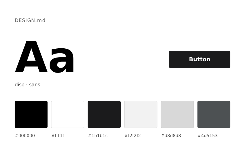
The Dash Digital Studio design system uses a light-themed visual language. The primary brand color is Carbon Text (#2a2a2a); text is Midnight Ink (#000000) on a Storm Canvas (#f0f0f0) background. Typography is set in Founders Grotesk and Editorial Neue. This DESIGN.md contains 5 color tokens and a 6-step type scale; give it to AI tools like Claude, Cursor or v0 to generate consistent interfaces in the style of Dash Digital Studio.
Independent Style Review
Architectural blueprints on concrete
Dash Digital Studio employs a stark and confident design language, built on a monochromatic palette of industrial grays and pure black. Typography is sharp and impactful, leveraging precise letter-spacing to create a sense of focused clarity. The layout is disciplined, using robust hairline borders to define content blocks, and relies on subtle motion and confident imagery over color to convey a sense of premium precision.
| Color | HEX | CSS token | Usage |
|---|---|---|---|
| Storm Canvas | #f0f0f0 | --color-storm-canvas | Page backgrounds, large content sections, subtle surface transitions |
| Carbon Text | #2a2a2a | --color-carbon-text | General text, secondary headings, link text, hairline borders, inactive navigation items — provides sharp contrast against light surfaces |
| Midnight Ink | #000000 | --color-midnight-ink | Primary headings, strong emphasis text, decorative borders for section dividers |
| Cloud Gray | #fafafa | --color-cloud-gray | Elevated card backgrounds, subtle highlight surfaces |
| Slate Divider | #d6d6d6 | --color-slate-divider | Subtle section dividers, background for less prominent informational blocks |
| Font | Weights | Fallback |
|---|---|---|
| Founders Grotesk | 300, 400 | Inter |
| Editorial Neue | 400 | Playfair Display |
| Role | Size | Line height | Token |
|---|---|---|---|
| caption | 12px | 1 | --text-caption |
| body-sm | 14px | 1.2 | --text-body-sm |
| heading | 22px | 1 | --text-heading |
| heading-lg | 40px | 0.9 | --text-heading-lg |
| display | 70px | 0.88 | --text-display |
| display-xl | 101px | 0.8 | --text-display-xl |